Case details
The problem
When a product grows fast, the design system often cannot keep up. At this company, engineers had been shipping independently across mobile and web, and over time, the cracks started to show. Components had drifted, accessibility standards were inconsistent, and the product no longer looked like it belonged to the same brand as the marketing materials. Customers noticed. And every new feature added more complexity to an already fragile foundation. Something had to change, not just cosmetically, but structurally.
The goal
To design a system that can evolve with both the product and the company while simplifying alignment and implementation for designers and engineers.
Team & Role
I led this project end-to-end as the lead designer, working alongside a UX designer, engineering leads for mobile and web, and marketing graphic designers. In practice, this meant I owned the strategic decisions: research, what to prioritise, how to structure the token architecture, and how to get engineering and stakeholders aligned. The UX designer and engineering leads were close collaborators throughout execution.
Client
SaaS company focused on helping Airbnb and vacation rental hosts protect their properties.
Impact
The rebuilt design system changed how the teams worked together. Handover became faster and more consistent. Engineers could make smaller UI updates independently without needing a designer in the loop, which removed a significant bottleneck in delivery.
The most visible proof came during the company’s next rebrand. What had previously taken around six months to roll out across all platforms took just four weeks. That is an 83% reduction in time, and it became one of the fastest cross-product rollouts the company had achieved. The design system did not just save time on that project, it proved that the foundation was now strong enough to absorb change quickly.

The process
RESEARCH & AUDIT
Before touching a single component, I needed to understand the full scope of what we were dealing with. I started by mapping a complete inventory of the existing system across all product surfaces, which includes: reviewing brand guidelines, collecting UI screenshots from both mobile and web, and auditing design tokens for colour, spacing, and typography.
The goal was not just to find problems. It was to understand why the system had drifted in the first place, so we could build something that would not drift again.
THE FINDINGS

The audit told a clear story. The design system had not failed, it had simply never been built to scale. Five things stood out:
- Components lacked clear interaction rules, so teams were left to interpret behaviour on their own, which is how inconsistencies compound over time.
- The Figma files, the documentation, and the live product no longer matched each other. There was no single source of truth, which meant every team was making their own interpretations.
- Accessibility was inconsistent throughout. Contrast issues and missing states were common, and there was no systematic way to catch them.
- The Figma files had become cluttered and hard to navigate, which slowed engineers down during implementation and created friction at exactly the moment when speed mattered most.
- There were no design tokens, which meant visual decisions were made locally and inconsistently rather than globally and intentionally.
The root cause wasn’t any single bad decision. It was the absence of a shared language between design and engineering. Every team had been making reasonable choices locally, but without a common foundation, those choices accumulated into inconsistency. That was the real problem to solve.
SYSTEM PRINCIPLES & ARCHITECTURE
Before rebuilding anything, I established a set of principles to guide every decision and function as working constraints that shaped the system’s design.
- Accessibility first – that WCAG AA compliance was the baseline, not a nice-to-have. Every component had to meet its requirements before it was considered done.
- Token-driven, not asset-driven – moving away from hardcoded values and toward a scalable token architecture that could support theming and future changes without manual overrides.
- Flexible yet opinionated – building components that allowed room for variation while still providing enough guidance that teams did not have to guess.
- Documented through real use cases, grounding every guideline in actual product scenarios rather than abstract examples, because documentation that does not reflect reality does not get used.
- Designed for product velocity – that every structural decision was made with delivery speed in mind, not just design quality.
Stakeholder alignment
Getting alignment across design, engineering, and marketing was as much a part of this project as the design work itself. One of the first things I worked through with the marketing designers was visual direction: specifically, how brand and marketing identity should translate to the product side, and where the two needed to diverge. From there, I ran regular feedback sessions with engineering leads throughout the rebuild. Not as sign-off checkpoints, but as working sessions where implementation questions got resolved early. By the time the components were handed over, engineers had already been part of the decision-making process, with no surprises on either side.
DESIGN TOKEN
The token architecture was the foundation on which everything else was built. I started with core tokens, such as colour, spacing, typography, radius, and shadows. These created a stable visual baseline across platforms. On top of that, semantic tokens handled theming and made sure styles could adapt to different contexts without manual overrides. Finally, component-specific tokens standardised behaviour within each component and removed the one-off styling decisions that had been creating drift over time.
Together, these three layers created a system that was consistent by default and flexible by design

COMPONENT REBUILDS
Every component was rebuilt from the inside out. I worked closely with a UX designer and engineering leads across mobile and web throughout the process. The goal was simple: what we built in Figma should translate directly into implementation, no interpretation needed, and follow industry standards like native components.
For each component, I delivered defined states and interactions, and clear usage guidelines grounded in real product scenarios. The Figma library was restructured from scratch, reorganised into a scalable architecture, with auto layout and variants for interaction states, so that engineers could work from it directly without needing a designer to interpret it.

Final Design: Key Decisions & Outcomes
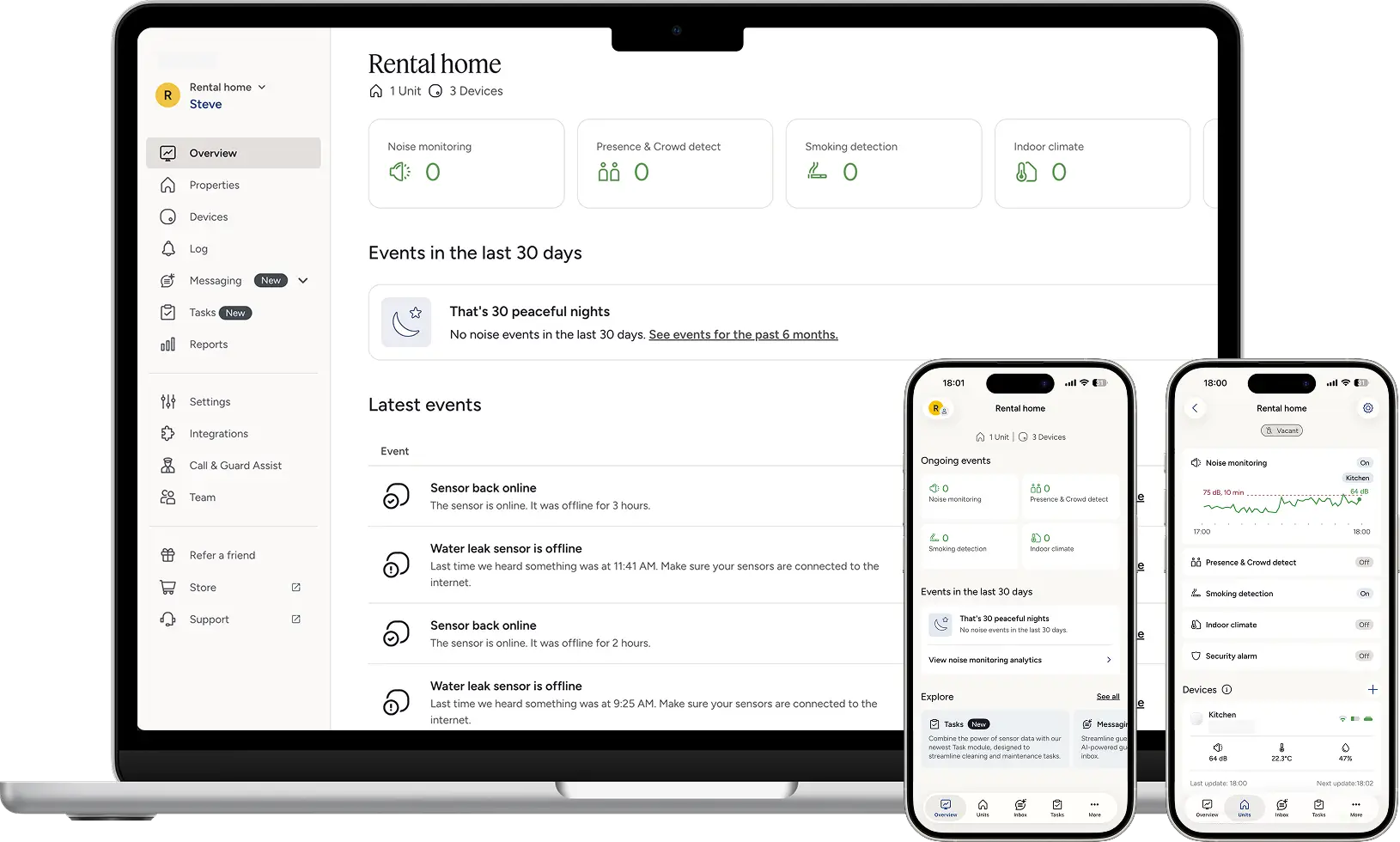
After the design system update, both the web and mobile apps are now visually consistent. The icons follow a similar approach, and the colours meet contrast requirements. It’s also become easier to collaborate with engineers, as we’re now speaking the same language when discussing components.

Closing reflection
What worked well
- Involving engineering and other stakeholders from day one. It kept everyone aligned and prevented the kind of late-stage surprises that can derail a project like this.
- Prioritising accessibility from the start, rather than retrofitting it later, also made a significant difference.
- Validating components against real product screens instead of abstract examples ensured the system reflected how the product actually worked, not just how we wished it worked.
What I’d do differently
- If I were doing it again, I would establish a more structured process for adding or updating new components over time, because a design system is only as useful as the discipline around maintaining it.
- Regular audits would also help catch drift early, before it becomes the kind of accumulated problem this project set out to solve.
A design system is not a design project. It is an infrastructure project. The goal is not a beautiful Figma file, but it is a team that can move faster, make better decisions, and spend less time resolving inconsistencies. That is what this project delivered, and the 83% reduction in rebrand time was the moment it became undeniable.