Case Details
The problem
On average, customers took more than a week to activate their accounts after purchase. That delay was not just an inconvenience, it was a business problem. The longer it took for customers to reach their first meaningful moment with the product, the less likely they were to renew.
The goal
Help customers quickly understand their next steps and start using the product without unnecessary delays.
Team & Role
I led this project as the lead designer, covering everything from research and stakeholder interviews to flowcharts, wireframes, and finalising the UI alongside engineers. A big part of the work was also facilitation, getting product manager and engineering aligned on what we could realistically solve in the first release, and making sure every decision was grounded in what we actually knew about our users.
Client
SaaS company focused on helping Airbnb and vacation rental hosts protect their properties.
Impact
The results were measurable across the full activation journey. The redesigned Thank You page drove a nearly 40% increase in customers moving from purchase directly into the app, turning what had been a dead end into a genuine starting point. Average activation time dropped to under a week, down from more than seven days at the start of the project. And customers reported feeling more supported throughout the process — something the customer suppor team noticed too, with fewer hand-holding requests coming their way.

The Process
Understanding Why Customers Were Stalling
To understand the actual cause of the problem, I pulled from multiple sources rather than assuming I already knew the answer. I reviewed previous user interviews to understand why customers were postponing activation, audited the existing dashboard UI and the end-to-end purchase journey to identify friction points, analysed product analytics to pinpoint where drop-offs were happening, and looked at how other services approached onboarding. I also mapped different user scenarios to understand how distinct customer types moved through the same flow in very different ways.


Four Problems, One Clear Pattern
Across all the research, one pattern emerged clearly: customers had no guided path from purchase to actually using the product. This showed up in four ways.
- After checkout, customers hit a dead end. The confirmation page had no clear route into the product, and once inside the app, there were no obvious next steps.
- The dashboard was sending the wrong signals. It showed everything as green even when no property nor device was connected, which made customers feel like setup was complete when it was not.
- The onboarding flow felt unfamiliar. It did not follow patterns users already knew from other products, adding unnecessary friction at the moment when people needed clarity most.
- Some delays were outside our control entirely. Things like logistics, device delivery times, and customer readiness were real blockers that no amount of UI improvement could fully solve. Acknowledging this early helped define a focused and realistic scope.
These insights clarified which problems we could solve directly and which required broader business changes. The MVP focused on the dashboard and Thank You page — the two places with the most immediate impact on activation.
Learning From the People Who Already Did It Well
With the findings mapped, I focused design efforts on what we could directly control: providing users with a clear, guided path from purchase to full activation.
An early insight came from discussions with the CSM team about how they onboarded clients manually. Their step-by-step rhythm was highly effective and became the foundation for the new flow. If it worked in person, it could work digitally.
I also drew inspiration from other onboarding experiences, confirming that step-based flows reduce users’s confusion by asking them to focus on one task at a time rather than overwhelming them. Early syncs with engineers ensured feasibility, and close collaboration with the PM kept the scope realistic and focused.

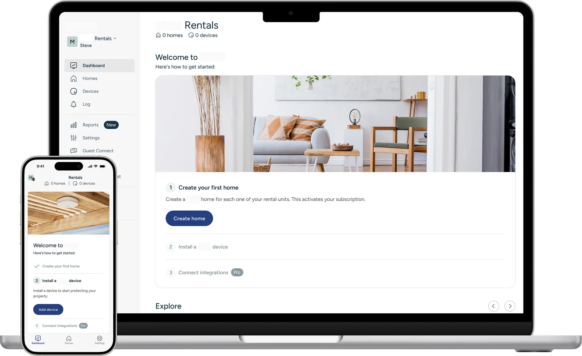
No Dead Ends. No Empty Screens. No Guessing.
The new onboarding flow was guided by a single principle: no user should ever wonder what to do next. I designed a step-by-step experience that worked for all user types, regardless of device or permission level, and picked up exactly where users left off if they stopped midway. The dashboard stayed hidden until core setup steps were complete. It was a deliberate constraint. We traded flexibility for clarity, and for users seeing the product for the first time, that was the right call.

Final Design: Key Decisions & Outcomes
Onboarding flow

The changes:
- Guided setup replaced the empty dashboard
- Before: the dashboard looked complete from the moment a user logged in, but it did not indicate what to actually do next. Users were left to figure it out on their own.
- After: a guided flow replaced the empty dashboard during setup. Each step was clearly outlined, so users always knew where they were, what they needed to do, and what was coming next.
- Status indicators now reflect reality
- Before: status indicators showed everything as green even when no device had been connected yet. It looked like setup was complete when it was not.
- After: these indicators were hidden until a property was added and a device was connected. A small change that removed a significant source of confusion.
- Setup became a starting point, not an endpoint
- Before: there was no natural moment to discover what else the product could do. Users completed basic setup and stopped there, often without realising more was available.
- After: the guided flow introduced additional features at the right moment—when users were already engaged and ready to explore. Setup became a starting point rather than an endpoint.
- The flow continued on mobile without dropping off
- Before: users who downloaded the mobile app were left without guidance on what to do next. The journey simply stopped.
- After: the mobile app continued the same guided flow, keeping users on track regardless of device.
Thank You Page: From Confirmation to Activation

The changes:
- Purchase confirmation became the first onboarding step
- Before: the Thank You page was essentially a receipt with some product imagery. It confirmed the purchase but did nothing to prepare the customer for what came next.
- After: the page was redesigned to show both the order summary and a clear set of actions customers could take while waiting for their device to arrive. What was previously dead time became productive time.
- Delivery wait time became setup time
- Before: customers had to figure out on their own how to do anything meaningful before the device arrived. They waited passively, which meant activation was always delayed by delivery times.
- After: customers could configure their properties in advance, so that when the device arrived, everything was already in place. Device delivery became a natural trigger for activation rather than the start of a longer setup process.
- The primary action pointed into the product, not away from it
- Before: the primary action was to read help articles. It was a safe default, but it sent users away from the product at the worst possible moment.
- After: the primary action brought users directly into the app to begin onboarding. Help and support remained available, but were no longer the first thing customers saw after purchase.
The MVP Was Just the Beginning
After the dashboard and Thank You page launched, we continued building on the momentum. The post-purchase welcome email was restructured to align with the new flow and set clearer expectations from the first touchpoint after checkout.
We also used the learnings from this project to identify additional low-hanging opportunities across the activation journey, treating the MVP not as a finish line, but as the first step in a broader effort to reduce friction for new customers.
Closing Reflection
This project taught me that activation problems are rarely just UX problems. They sit at the intersection of product, operations, and customer expectations. Getting to a good solution meant understanding all three, not just the screens. It also changed how I approach scoping. I now push earlier to map the full journey before narrowing down, so the MVP is chosen deliberately rather than by default.